
This module is focused about learning and honing our skills within the adobe suite, focusing on Photoshop, Illustrator and After effects.
The first session we mainly learned about cutting with the selection tool which was fairly basic however in the second practical session we learned about how to manipulate something once you have cut it out.
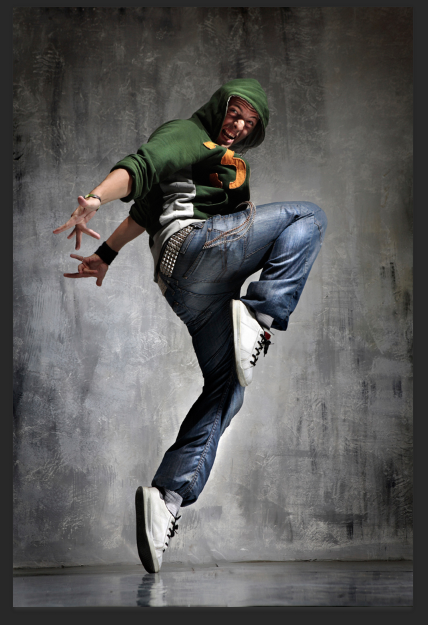
The image above is the one I used to manipulate.
BRIEF:
There are 3 projects to submit for marking. 2 graphics design project, the 1st in Illustrator, the 2nd in Photoshop. The 3rd project will be an animation show reel. Each project will be aimed towards your personal portfolios, so you should strive to push your individual design and creative media production skills.
LOGO
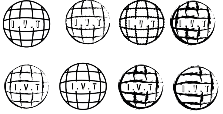
initial ideas
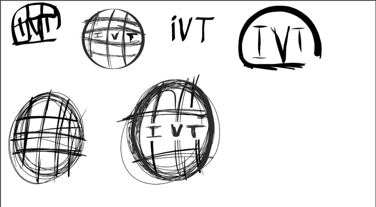
These were my initial ideas which produced on my iPad, they all incorporate elements of a circular type; which is very relevant to the brief. I think the one I will develop further will be the last one on the bottom row.
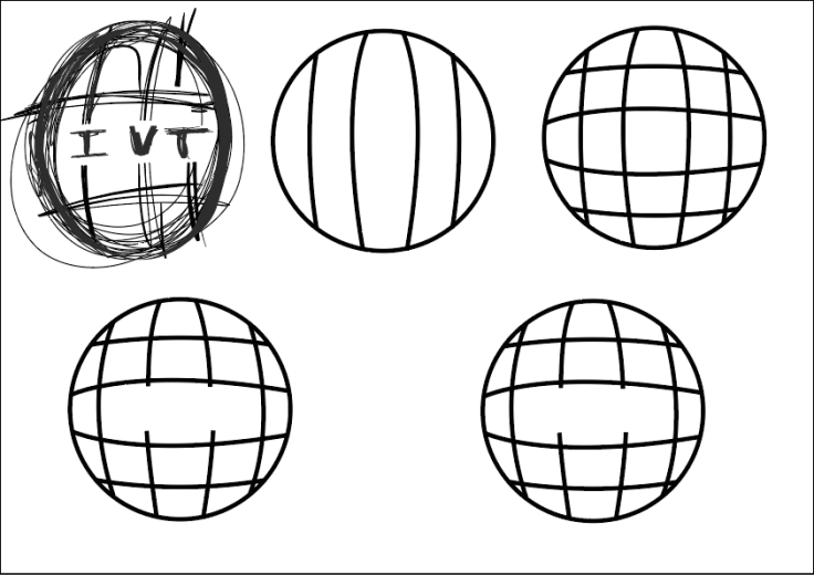
This was my development of the first idea, I really like the shape and dynamic of the logo; however I think I need to do some typographic experiments to see which lettering fits best with the shape at the moment.
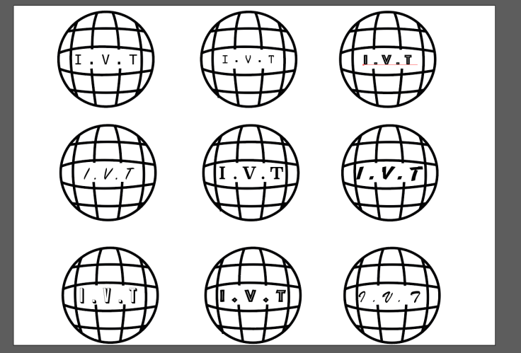
This is my typography comparison to see which experiments with a range o different type sets to see which works best with he general shape and dynamic of my logo; overall I like think the bottom left logo works the best (using Balboaplus), as the general shapes is fairly overpowering and strong therefore needs a bold type face to accompany it.
At this stage in the brief, I tried to experiment with different creative aesthetics and decided the logo below looked best and had both a creative flare and encapsulated what the IVT is.
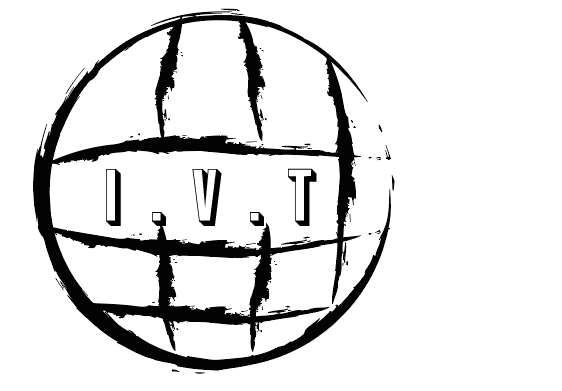
This is the final logo shape.
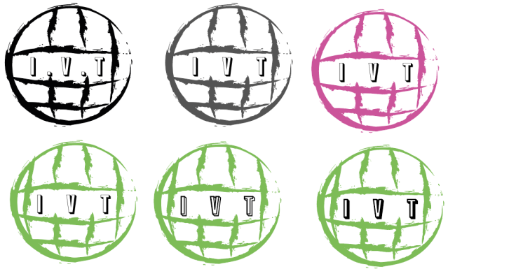
Now I had a final logo shape to work with I had to come up with a colour palette which was fairly easy considering I already had a defined idea of what I wanted the final product to look like. I firstly tried grey which didn’t stand out enough, and thought something with a bit more of a punch would work better; thus I tried pink which was overkill and was to brash. Finally I tried a light green which worked perfectly with the black type. I also tried to play with the stroke and fill of the type and decided to stick with the below image.
![]()
This is the final logo. I used a range of creative process to produce my final logo; such as sketching, typography tests and colour experiments. The logo was produced Adobe illustrator and used the pen and circle tool to create the basic shape; I then developed this further by changing the line type which with the colour and type choices makes for a clean and precise logo with a creative flare.
Poster
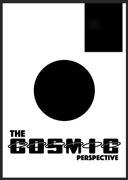
Firstly I used Adobe Comp to produce a basic outline for my poster, I wanted the centre focus to be on a main illustration accompanied by a bold sans typography.
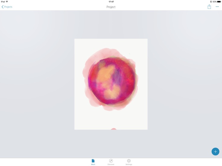
I then used my iPad Pro and Adobe Photoshop sketch to produce the main illustration which I based on a nebula but in a watercolour style, with watermarks leaking out; I felt this would pull the poster together as it would leak over the surrounding type.
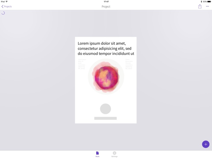
I then brought the logo back into Adobe comp to see what it looked like, and felt it would compliment my chosen fonts.
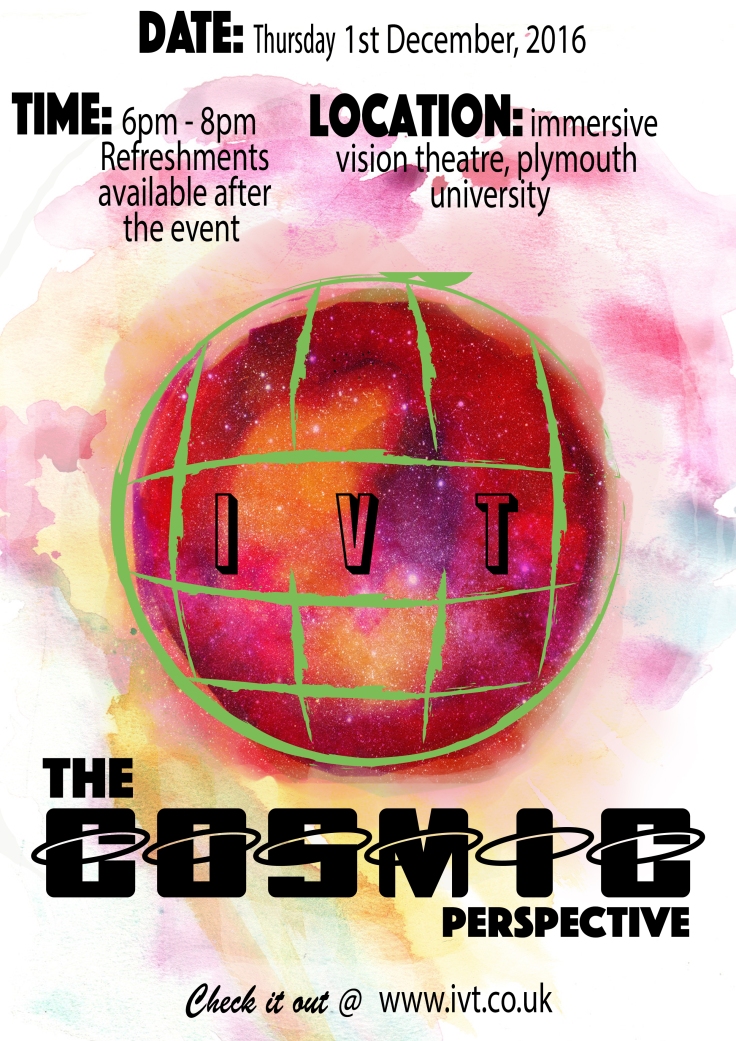
This is my final poster for The Cosmic Perspective event, overall I think it is a success and all the elements and the way they were applied makes the poster not only noticeable with a plethora of colours but also effective in its approach in communicate the basic information about the event.

Leave a comment